Packaging Rebrand with UX principles
Imagine Crafts, headquartered in Seattle, Washington, is a prominent player in the Arts & Crafts industry. Notably, Imagine imports Tsukineko ink from Tokyo, Japan, and seamlessly distributes it to renowned retailers such as Amazon, Joanns Crafts Stores, Michaels, and Paper Source. This premium ink is meticulously crafted for a diverse range of creative applications, including paper crafting, mixed media, and fabric arts.
Another adventure Imagine Crafts has taken on is offering crafting tools such as brushes, sponges, high-density foam, and more. In this rebrand, my goal was to elevate the overall look & feel of the Imagine Crafts tools brand starting with DoodleStix.
Former Doodlestix Packaging Look
Here is an example of the previous Imagine Crafts packaging. It has low brand visibility with the logo that was difficult to find.
Research
The crafting industry is incredibly diverse, encompassing a wide array of hobbies and creative pursuits. From paper crafts and card making to mixed media art, jewelry crafting, painting, embroidery, baking, sewing, and knitting, it offers a rich tapestry of artistic expressions.
Crafting speaks to a broad demographic, primarily attracting women between the ages of 25 and 55, often belonging to the middle-class bracket and married with children. This vibrant community finds solace in crafting, which not only fuels their personal passions but also serves as a communal activity within families. Crafting is a cherished tradition for many, providing a creative outlet to commemorate special occasions, celebrate holidays, mark significant milestones like weddings, graduations, and baby announcements, with women often leading the charge in orchestrating these memorable gatherings.
Creating a Mood Board
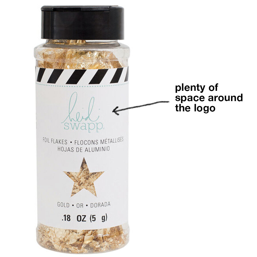
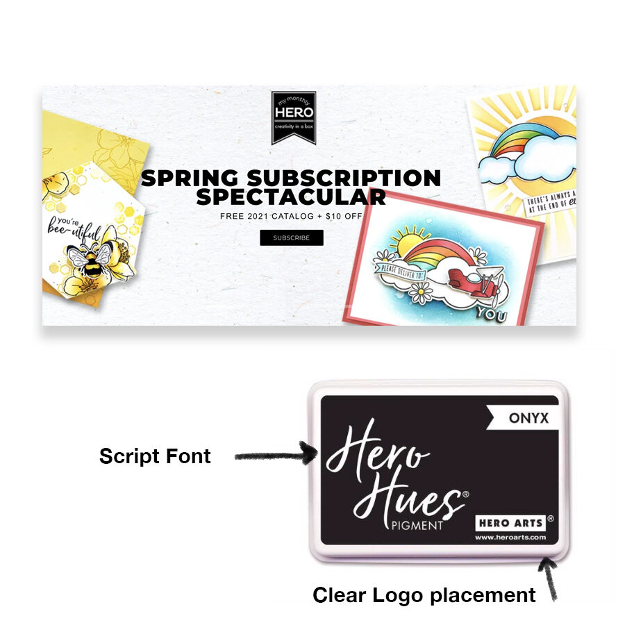
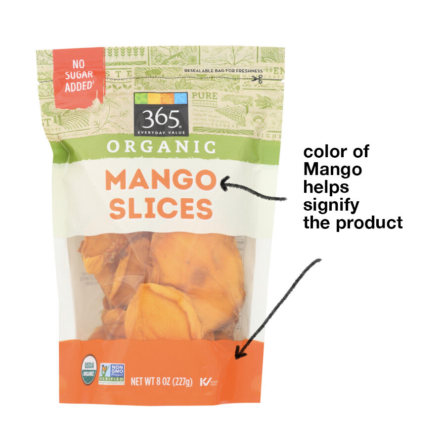
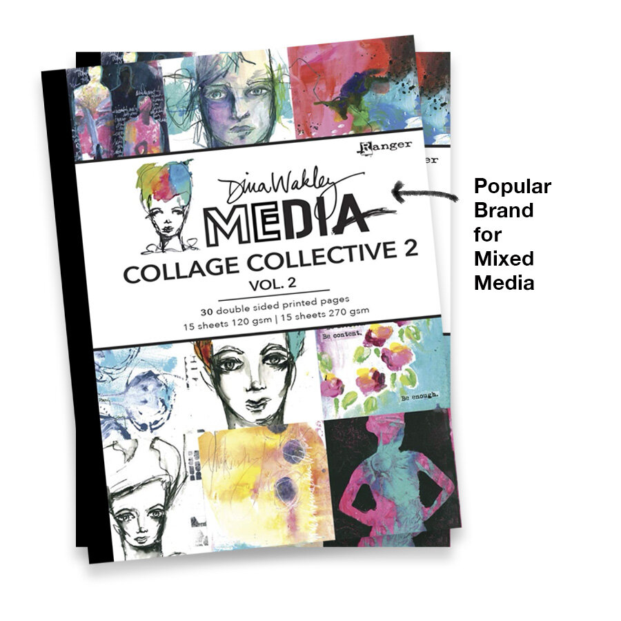
To capture the essence of Imagine Crafts' fresh new look and feel, I went on an exploratory journey, drawing inspiration not only from the world of crafting (direct influence) but also from the food industry (indirect influence). Within this spectrum, I curated a selection of sample images, which played a pivotal role in the research phase of our rebranding project.
These examples encompass a range of sources, from well-known brands to competitor products and even demographic-specific items, such as those found at Whole Foods. They collectively provide a valuable wellspring of insights to shape and inform our rebranding strategy.
Solution
To address the rebranding challenge, it became evident that a streamlined and concise set of standards was essential. These standards were designed to enhance the user's interaction with the product by efficiently organizing the information on the packaging.
The development of a comprehensive style guide, offering precise and coherent directions, played a pivotal role in establishing a well-structured hierarchy for the information. This hierarchy ensured that crucial product details were front and center, thus enabling customers to swiftly grasp the product's purpose. This approach not only eliminates any potential obstacles that could arise from difficult-to-read text but also eradicates any ambiguity surrounding the product's functionality, providing an intuitive and seamless user experience.
Results
The rebrand was a success.
Implementing these packaging standards bore fruit in the form of an impressive six new SKUs being added to a purchase by a major retailer in 2019. These standards not only boosted overall sales but also fortified our client relationships.
The fresh and improved look of our packaging has been instrumental in facilitating effective conversations for our sales team. It equips them with compelling talking points, enhancing their ability to engage with clients and communicate the product's value proposition more effectively.
Packaging in stores at Joanns Crafts, Phoenix, Az.


